Evaluation maps or site assessments are useful in designing interventions or a management strategy. In Geodesignhub, they are simple red / yellow / green maps that tell the designer locations where intervention is required and where they should be careful. A sample is below:
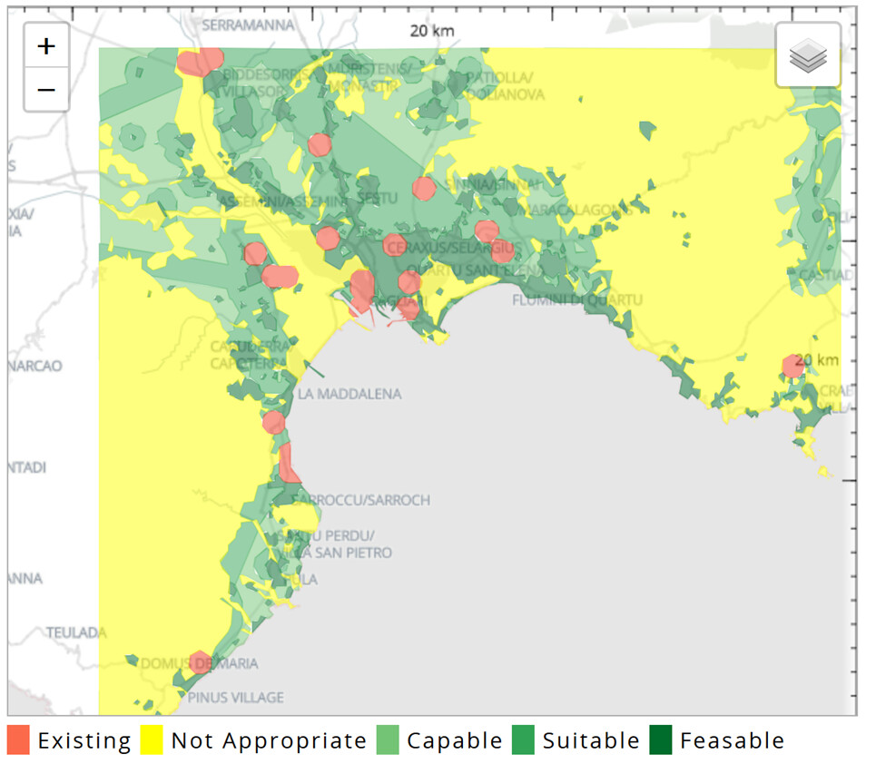
If the project participants are familiar with the study area, evaluation maps may be less useful since they can rely on their local knowledge. For large study areas, evaluations are very useful. Evaluation Maps can be created using three or five colors; using three colors could simplify things for you.
There are three ways to create evaluation maps:
- Sketching by hand using printed maps and red, yellow, green markers and digitizing the sketched maps directly on Geodesignhub.
- Using GIS software and existing data such as QGIS / ArcGIS to build these maps.
- Using automated tools and scripts, this is most suitable if you don’t want to build the maps. You will need basic programming knowledge so if you don’t have the resources, we can run these scripts for you and your project. They are free and opensource and use opendata. (OpenstreetMap, CORINE, Sentinel Data, NLCD etc.) :
- Worldwide: Openstreetmap Evaluations Builder for study areas that are small
- Worldwide: Sentinel Evaluations Generator for larger study areas.
- Worldwide: ESA CCI Evaluations Generator
- For EU Only: CORINE Evaluations Generator / Urban Atlas Evaluations Builder
- For US only: NLCD Evaluations Builder
For more information about these tools please review this PowerPoint Presentation
Additional Notes
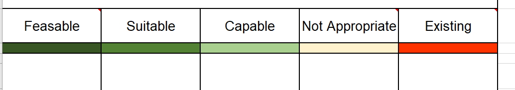
Evaluation models can be created using the setup sheet provided since it will help in identifying data sources and building a legend for the colors. The figure below details the legend for the five columns:
All evaluation maps can be shown in a simple three or give color map: Red , yellow and green, or red, yellow, green, green2, green3.
Legend
1 (red) is where the system is “existing” already and in a healthy state, meaning that it is feasible to remain.
2 (yellow) is lowest priority for change. “not appropriate” or not capable of supporting the system, meaning don’t put it there, e.g too wet or steep or unless you provide change to the basic area conditions e.g fill in the ocean for new land, regrade the mountain, etc.. (all very risky projects).
3 (green) is low but higher priority. ”capable”, meaning that you can place it here IF you also provide the technology and market to make it feasible, e.g. water and sewers, access roads for mechanical harvesting, etc., and the market comes.
4 (green2) is higher priority. ”suitable”, meaning that the area is capable of supporting the project and it already has the appropriate technologies to support the activity taking place e.g. septic tank soil or sewers, access roads for mechanical harvesting, etc. BUT there may not yet be a market for the change.
5 (green3) is the highest priority for change. “feasible”, meaning that it is suitable AND there is a demand or market to provide the new land use change, e.g that someone wants to buy the product or new house (and at a profit) OR that the government wants to protect and improve an historical landscape .
These details have to be filled out by project administrators on a per system basis. Once the criteria are set, you can build five-colored Evaluation Maps using traditional GIS tools. While this process varies between different users and techniques and is specific to the study area and produce a five color map.
Tips
Review the Tips for preparing data in GIS software article for further information.
Sample files
Uploading evaluation maps
Once the maps are complete and built, you can upload them to your project, review the How to upload evaluation maps article.