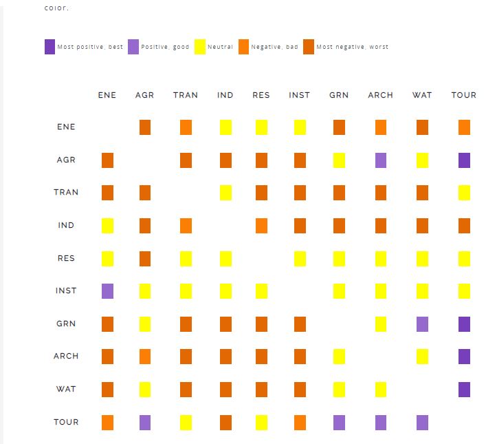
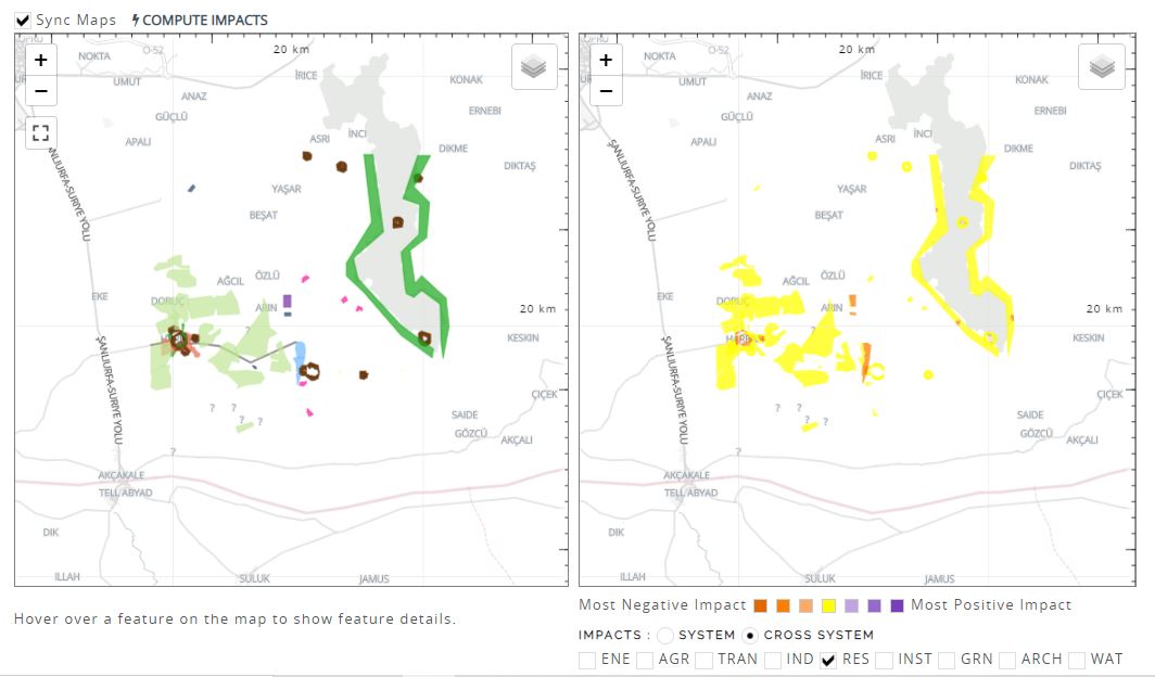
I conducted a cross systems analysis for SCENARIOS FOR HARRAN DISTRICT based on the matrix attached. I don’t understand why most of the projects appear in yellow color. According to the matrix especially the locations where agricultural projects have been located should be shown in red color.
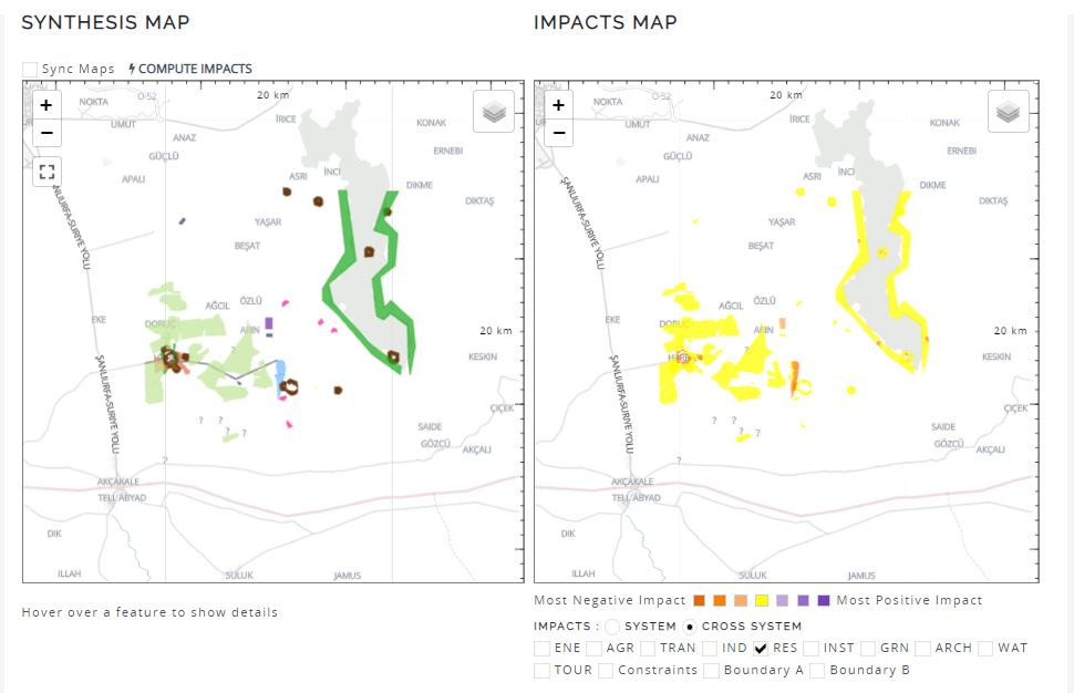
I am fascinated by your dilemma. When comparing your matrix to your impacts map, I see a general convergence in the colors depicted and general conformity between the impacts for the residential system (in the matrix) and the map.
From what I can see, you have about 90% neutral impact from your matrix and somewhere around 10% ‘most negative worst’ impact. This seems to square with your impact map.
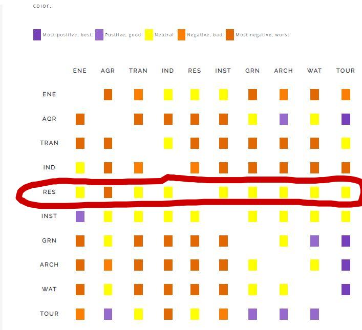
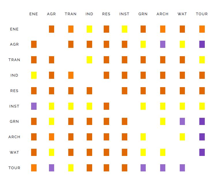
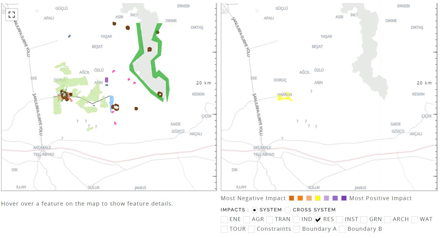
The coding is not a problem. This is what my SM experts say. However, I find it strange that for RES the color always remains yellow despite the changed matrix I have attached as well.
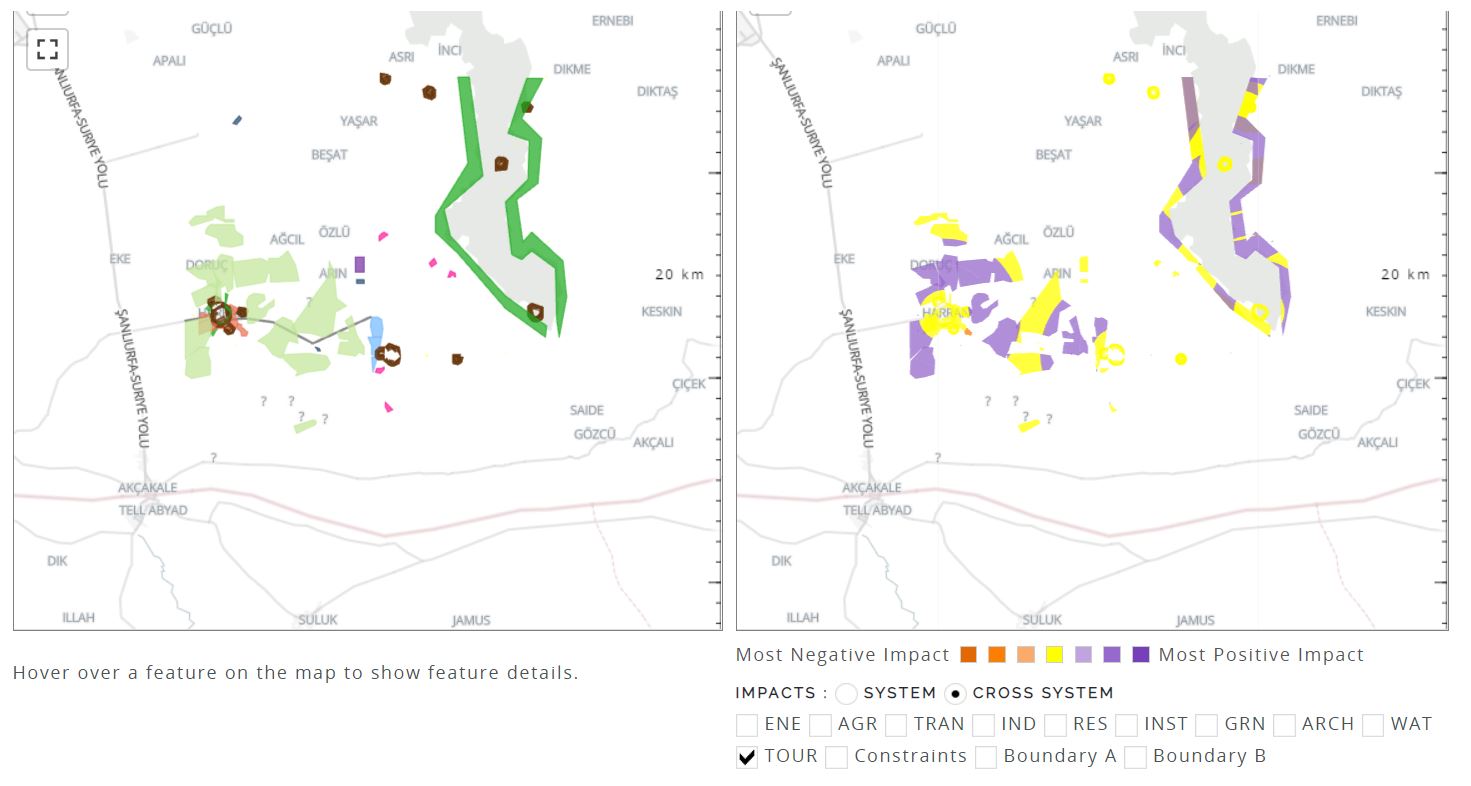
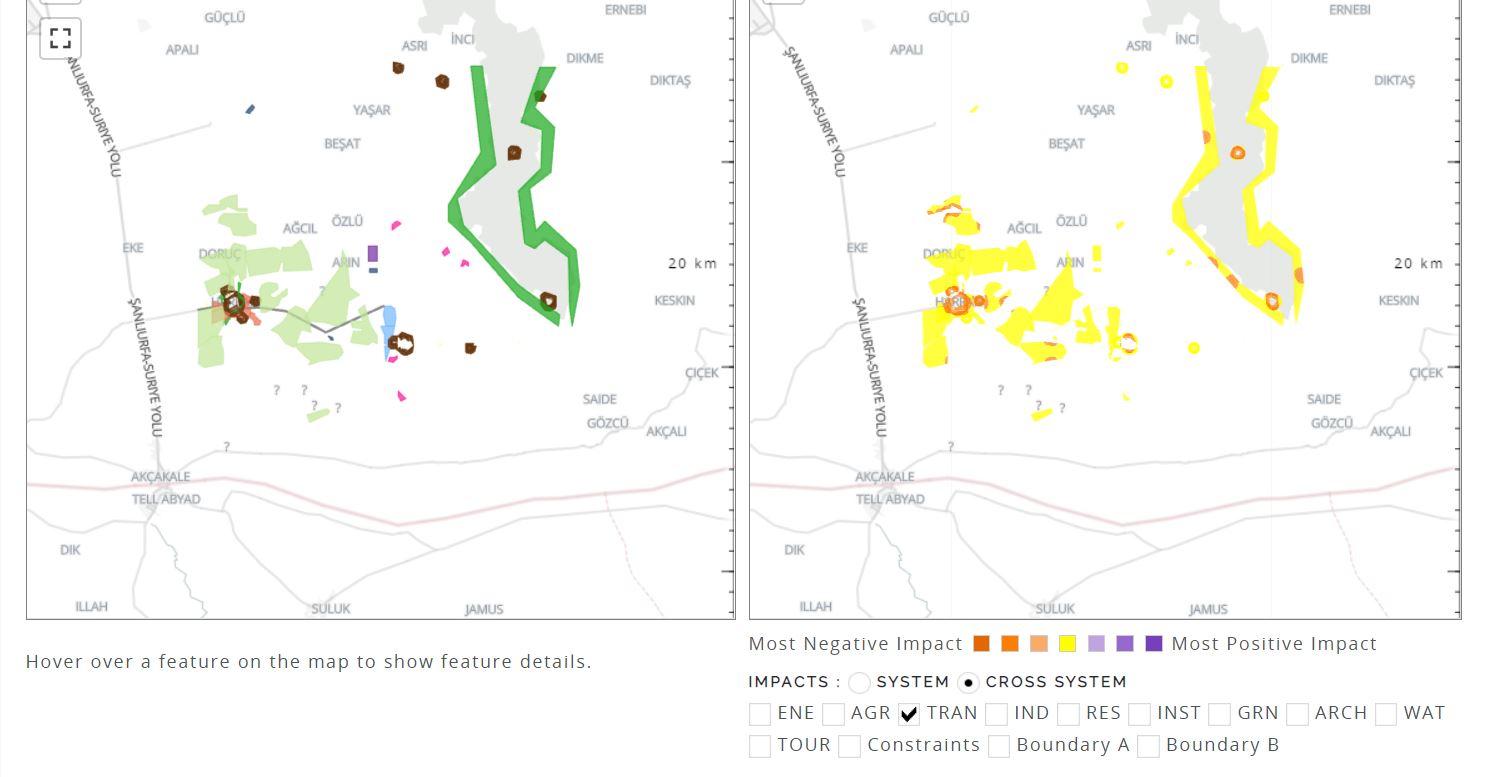
Hmmm … I see your point; must admit that I am a bit stumpted on the issue. Could I ask you to humor me and try two things? 1. Try analyzing another system (i.e. Tourism, Transportation, etc.) and observe the result, and 2. (separately) change the ‘impacts’ setting from ‘cross system’ to ‘system’ …
If you’d keep me informed of the outcomes, I would be much obliged.
Hi Fred, Apologies for the delay in my response the only comment I can have at this point is if you can share the evaluation map as a screenshot also another recommendation is to just use one diagram (instead of a full design) so just pick one res diagram.